|  ineare Serif is an attempt at the hard job of text typographies, seeking new ways that will provide readers with some pleasure and some rest while they walk along each line, creating a space where there is harmony between the printed form and man. ineare Serif is an attempt at the hard job of text typographies, seeking new ways that will provide readers with some pleasure and some rest while they walk along each line, creating a space where there is harmony between the printed form and man.
|
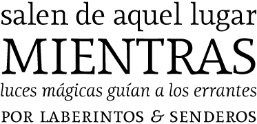
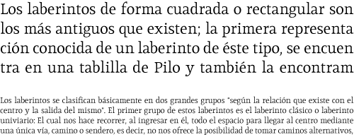
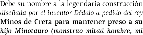
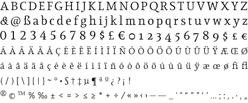
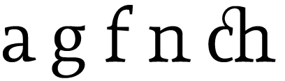
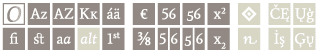
Asymmetric serifs both in their height and width, medium contrast
in the stroke and balanced upward and downward movements, make
“Lineare Serif” a typography featuring attitude
and aptitude for editorial purposes. |